Final Documentary
A2 Media!
Wednesday, 29 December 2010
Wednesday, 15 December 2010
Evaluation 4
Q4) how did you use new media technologies in the construction and research, planning and evaluation stages?
I have used many media technologies throughout the research, planning and evaluation stages.
Firstly in my research and planning stages, I used many media technologies, such as; The internet. Before we even started i researched into what a documentary was and what different types of documentarys there are. I researched topics for our final documentary by looking on google and other web searches to get information and secondary research about attraction and by looking through internet images to see what represents attraction, also researching common sayings that are relevant to attraction such as 'birds of a feather flock together' this gave us an insight and knowledge aboout attraction so we knew ourselves what we wear talking about, which helped when coming to film our expert physcologist. I also researched many other attraction documentaries on youtube, to get an insight into the content and layout of how they placed all the key elements together, what worked and what didn't work in their documentaries so we knew what would look good and proffesional.
I also used the internet in order to plan for my film poster, looking at all kinds of channel 4 posters, and annotating and analysing them to see the key features, colours, text, layout etc that channel 4 posters had used, so that our poster would reflect this and look proffesional.
And thirdly looked on the internet to listen to radio trailers, I then made notes of all the codes and conventions of radio trailers (which are placed on my blog), which helped me place all the bits and pieces together to make our own radio trailer.
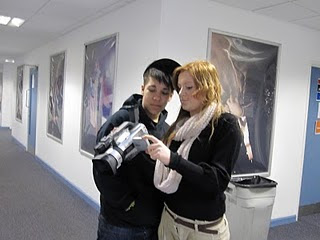
In the planning stages i also used media technologies, by creating a film diary, and digital camera images of us, it explained what we had filmed, when we filmed it and how well it did or didn't work. When we were filming we made sure that the locations, settings, and camera was all fully correct and set up perfectly, we asked permission and made sure that it was ok to film were we were in Warrington town centre. When we were filming we each made sure that the camera angle and stand point of the person was correct to make it look proffesional and as perfect as possible.

I used Microsoft word in order to create our target audience research questionnaires, we used word because it was simple to type and easy to bullet each question from the next.
I then used Microsoft excel in order to create pie charts for our answers, which worked really well to come up with our conclusions and end results, we could see clearly our end results and we got a lot of information and inspiration from our results.
I also used Microsoft PowerPoint in the research and planning stages, to create timelines and brainstorms of idea’s, which were very useful as I could make as many points as possible to link everything together, and gave us loads of idea's to work with about the content of our idea's and it explains on my blog brainstorm why we used certain things.
In the construction stages we used a variety of media technologies.
We used all the camera equipment that was offered to us to be sure to create a variety of shots, angles and frames. We used the tripod and camera to film our vox pops in Warrington town centre; this created a still framing and made all the shots calm and clear. We also use this equipment to film our interviews because we wanted the shot to just sit facing the people we interviewed, it would stay steady and flow really smoothly.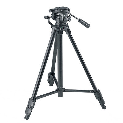
We also used the camera and microphone in order to film our radio trailer and narration in the red room, the microphone made the narrators voice sounds clear and strong and was of a really good sound quality.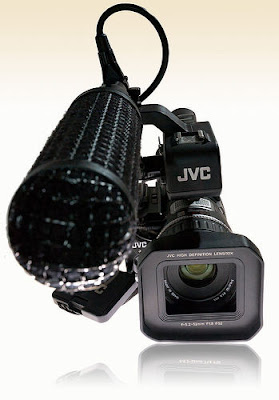
I also used Adobe Photoshop a lot throughout to construct our film poster, which was really good, as we could play around with colours, sizing, scale etc to create the best poster that we possibly could, and it helped us as we could change almost everything we wanted to, and add different text, font and images.
We used digital cameras in order to take pictures of our poster, we took a variety of pictures and selected the best quality ones and the one that related mostly to our film, and we also took pictures of ourselves in the filming process with all the equipment.
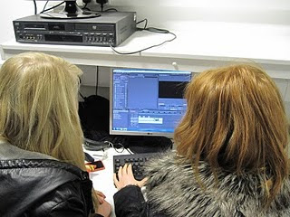
We used adobe premiere to edit and capture our entire documentary opening, we were not new to working with Adobe Premire so we knew what we were doing and had knowledge and understanding as to how to use it. We cut all of the shots down so that everything flowed well and was as perfect as we could get it, we mainly used cross dissolves throughout which worked really well and looked professional for them shots that we could not change but could fiddle around with. Throughout the interviews we added cut a ways in unclear stops and starts and when the interview was getting to long, to make it more interesting and entertaing which is very common with documentarys. We adjusted all our sound levels so it was all the same level throughout and was clear, bold and on the same pace throughout and all was on one level, we made the narration loud, as when we put it into premiere it was far to quiet and didn’t work very well, so by adjusting it, it flowed really well. We also created many effects with the titles and graphics, by getting a pair of lips to kiss the screen to make it fun and cheeky and getting hearts to float across the screen-this was quite difficult to do but once we got the hang of it, it became a lot simpler to do. We also added archive footage from skins, eastenders and coronation street from youtube.com, this was to add kissing scenes and love scenes into our documentary which would last about 20-30 seconds, and related perfectly to our theme.
In the evaluation stages I have used many conventions and media technologies, for example; I have filmed myself answer the questions by using the camera, tripod and microphone, I have also written essay answers with lots of details, images and screen grabs from our documentary piece to compare to real media technologies, also i have used audio sounds of myself answering questions.
I think because we have learnt and used real media technologies, it has given us a broader insight and helped us alot throughout creating our documentary piece, it has made me more confident using Adobe Photoshop and Adobe premire, and i can now work with the camera equipment really well and have a clear understanding as to how to use everything.
I have used many media technologies throughout the research, planning and evaluation stages.
Firstly in my research and planning stages, I used many media technologies, such as; The internet. Before we even started i researched into what a documentary was and what different types of documentarys there are. I researched topics for our final documentary by looking on google and other web searches to get information and secondary research about attraction and by looking through internet images to see what represents attraction, also researching common sayings that are relevant to attraction such as 'birds of a feather flock together' this gave us an insight and knowledge aboout attraction so we knew ourselves what we wear talking about, which helped when coming to film our expert physcologist. I also researched many other attraction documentaries on youtube, to get an insight into the content and layout of how they placed all the key elements together, what worked and what didn't work in their documentaries so we knew what would look good and proffesional.


I also used the internet in order to plan for my film poster, looking at all kinds of channel 4 posters, and annotating and analysing them to see the key features, colours, text, layout etc that channel 4 posters had used, so that our poster would reflect this and look proffesional.
And thirdly looked on the internet to listen to radio trailers, I then made notes of all the codes and conventions of radio trailers (which are placed on my blog), which helped me place all the bits and pieces together to make our own radio trailer.
In the planning stages i also used media technologies, by creating a film diary, and digital camera images of us, it explained what we had filmed, when we filmed it and how well it did or didn't work. When we were filming we made sure that the locations, settings, and camera was all fully correct and set up perfectly, we asked permission and made sure that it was ok to film were we were in Warrington town centre. When we were filming we each made sure that the camera angle and stand point of the person was correct to make it look proffesional and as perfect as possible.


I used Microsoft word in order to create our target audience research questionnaires, we used word because it was simple to type and easy to bullet each question from the next.
I then used Microsoft excel in order to create pie charts for our answers, which worked really well to come up with our conclusions and end results, we could see clearly our end results and we got a lot of information and inspiration from our results.
I also used Microsoft PowerPoint in the research and planning stages, to create timelines and brainstorms of idea’s, which were very useful as I could make as many points as possible to link everything together, and gave us loads of idea's to work with about the content of our idea's and it explains on my blog brainstorm why we used certain things.

In the construction stages we used a variety of media technologies.
We used all the camera equipment that was offered to us to be sure to create a variety of shots, angles and frames. We used the tripod and camera to film our vox pops in Warrington town centre; this created a still framing and made all the shots calm and clear. We also use this equipment to film our interviews because we wanted the shot to just sit facing the people we interviewed, it would stay steady and flow really smoothly.

We also used the camera and microphone in order to film our radio trailer and narration in the red room, the microphone made the narrators voice sounds clear and strong and was of a really good sound quality.

I also used Adobe Photoshop a lot throughout to construct our film poster, which was really good, as we could play around with colours, sizing, scale etc to create the best poster that we possibly could, and it helped us as we could change almost everything we wanted to, and add different text, font and images.
We used digital cameras in order to take pictures of our poster, we took a variety of pictures and selected the best quality ones and the one that related mostly to our film, and we also took pictures of ourselves in the filming process with all the equipment.

We used adobe premiere to edit and capture our entire documentary opening, we were not new to working with Adobe Premire so we knew what we were doing and had knowledge and understanding as to how to use it. We cut all of the shots down so that everything flowed well and was as perfect as we could get it, we mainly used cross dissolves throughout which worked really well and looked professional for them shots that we could not change but could fiddle around with. Throughout the interviews we added cut a ways in unclear stops and starts and when the interview was getting to long, to make it more interesting and entertaing which is very common with documentarys. We adjusted all our sound levels so it was all the same level throughout and was clear, bold and on the same pace throughout and all was on one level, we made the narration loud, as when we put it into premiere it was far to quiet and didn’t work very well, so by adjusting it, it flowed really well. We also created many effects with the titles and graphics, by getting a pair of lips to kiss the screen to make it fun and cheeky and getting hearts to float across the screen-this was quite difficult to do but once we got the hang of it, it became a lot simpler to do. We also added archive footage from skins, eastenders and coronation street from youtube.com, this was to add kissing scenes and love scenes into our documentary which would last about 20-30 seconds, and related perfectly to our theme.

In the evaluation stages I have used many conventions and media technologies, for example; I have filmed myself answer the questions by using the camera, tripod and microphone, I have also written essay answers with lots of details, images and screen grabs from our documentary piece to compare to real media technologies, also i have used audio sounds of myself answering questions.
I think because we have learnt and used real media technologies, it has given us a broader insight and helped us alot throughout creating our documentary piece, it has made me more confident using Adobe Photoshop and Adobe premire, and i can now work with the camera equipment really well and have a clear understanding as to how to use everything.
Evaluation 3
What have you learned from your audience feedback?
To get our audience feedback I did a variety of things. Firstly I put our Documentary on youtube, and got as many people to watch it and give us feedback, I also showed many people our poster and asked them to listen to the radio advert, so to get conclusions about this, I gave out 16 questionnaires asking what they thought of our documentary, and asked them to give me honest opinions.
The feedback that we received from these results has been written down and I have done a conclusion on Microsoft Excel from the questionnaires and I have also filmed some answers, to what they thought of the documentary when it was on youtube.
Questionnaire and results that I gave out to a number of people:
1) Did you like our documentary?
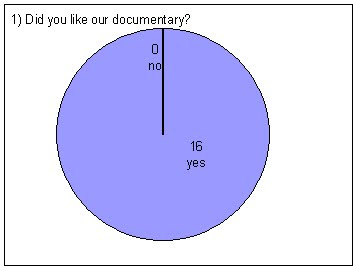
From this result i learnt that all the of the 16 people that filled out our questionaaire did like our beginning opening to documentary, which was very pleasing and a good result. We learnt that all our hard work has paid off and people said they enjoyed it, everyone that we asked enjoyed it which is a very postive conclusion.
2) Explain your resons (Why yes? Why no?)
This answer gives us the conclusion that many things are liked about our documentary, particulaly our choice of interviews, which i also think are our strongest element. Our animations are also popular, so we learnt that its better to have cheeky, fun animations to relate to attraction and love.
3) What could we improve on?
This gives us the conclusion that the sound is our weakest element, as it sounds uneven on youtube at the very beginning because of the music and voiceover, however after playing around with the volume levels are sound is now fixed and correct on adobe premire.
4) Does the theme interest you?
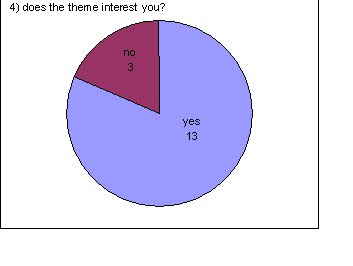
Most people said that the theme interested them because of the fact that their has never really been any documentarys about that explain about attraction, so would be interesting to find out more. I learnt that the 3 people that said no were not interested because they weren't really bothered about finding out attraction and it's just something that happens and they believe its a natural feeling.
5) After watching the introduction, would you want to watch the full half n hour?
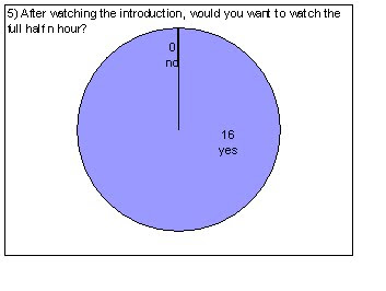 This outcome was very positive, as everyone we asked wanted to watch the full thing after seeing the first 5 minuites, from this i learnt that the most important part of a documentary is the first few minuites because people instantley can dicide weather they want to continue to watch it or turn over!
6) Do you think our interviews worked well?
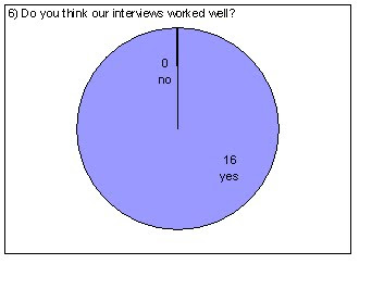 All 16 people that filled in our questionaire said that they thought our interviews worked well, this was because of the choice of interviews we used and the fact that we varied the age, sex, and genders to make it different and many different answers. We also learnt that in our interviews they all gave different answers to the same/similar questions, making it more varied and showing peoples different oppinions.
7) What did you think of the choice of music and voice over?
We learnt one again that our music at the beginning sounded a bit uneven and the music and voiceover in the first 5 seconds sounds a bit unlevel, however this concluded that the rest of the levels of sound is perfectly fine and the voice over is easy understood and clear to hear by our audience.
8) Do you think our film poster relates to our documentary? Why?
I asked many people this question and got all positive answers and will note down some of their answers:
1) I really liked your film poster, i think the picture is very strong and clear, it looks proffesional and i could see it up on a bill board somewhere passing by, and would no straight away that it was a channel 4 poster. Your main image is the strongest thing and is very well took and looks like a couple heavily in love.
2) The film poster is my favorite thing, i really like it, i think it's because it looks proffesional and is very eye-catching, as soon as i saw it i knew it had something to do with love or attraction, i like the fact that their is not to much overpowering font, but just important information and a cheeky 'do you fancy it?' line!
From this answer and others similar we learnt that our film poster worked really well and that people really did like it, i think the strongest point of the poster is the main central image because it is so powerful and meaningful and represents alot of things such as; love, happyness, lust and attraction which all heavily relate to our docmentary.
9) Did you like our film poster? And why?
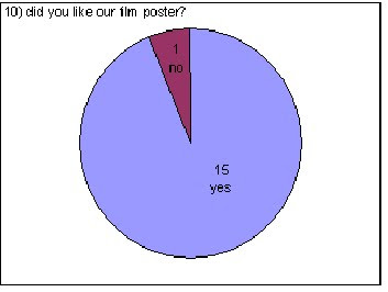 The majority of people said they liked our film poster for many reasons; People said they really liked the picture and thought it looked very professional, they also thought it resembled the channel 4 posters well as it looked very similar to them, they liked the fact that the picture was very eye-catching and that the boy and girl on it looked in love and happy relating to attraction/love. However one person said they didn't, we asked them their reasons and we learnt that they didn't like the style of font that we used and thought it should be bigger, they also thought that we should of made the photo black and white to make it more romantic. This gave us some good feedback which we can take on board for future.
10) What are your opinions of our radio trailer?
 "I thought your radio trailer was good, however i didn't really like the girls voice who spoke throughout, i thought her voice was very bland and boring, and didn't really interest me that much, i liked the fact that you added small clip bits from your documentary into your radio, i thought that was very clever and good."
"the radio trailer was the weekest for me, purley for the fact of the girls voice, she seemed abit dull and not fun and fresh, i also think to make it better you should have played music the hole way through to make it more exciting and fun and would of been a good song to play."
"The radio trailer was OK, i liked the things the girl was saying and it probably would of checked out your documentary, however i think you should of used the girl from your documentary on your voice over."
"I liked the fact that you used the same peice of music in the radio trailer and in the documentary, it tied it all together and made that song relevant to your piece."
"I really enjoyed your radio trailer, i thought it all flowed well and was like a proffesional one that you would hear on the radio, the only problem would be that the girls voice could of done with being a bit louder and abit more enthusiastic."
11) Would you be willing to watch our documentary after listening to the radio advert?
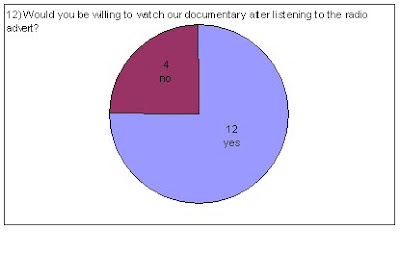
3/4 of the people said they really liked our radio trailer and thought it sounded good however a quarter of the people said they would not be willing to watch the documentary after listening to the trailer, there were many reasons for this such as:
1) The girls’ voice that we used to voice over, was a bit dull, and not very exciting making them not want to watch it as she had a boring voice.
2) The sound wasn't at a steady pace and seemed a bit up and down and dodgy-making it seems unprofessional.
3) The music needed to be on a little bit longer, as the music was fun, exciting and upbeat and it wasn't played for long enough.
4) Voice-over didn't seem very enthusiastic-sounded bored and sad.
12) What is your favourite item out of the radio trailer, documentary and poster? And why?
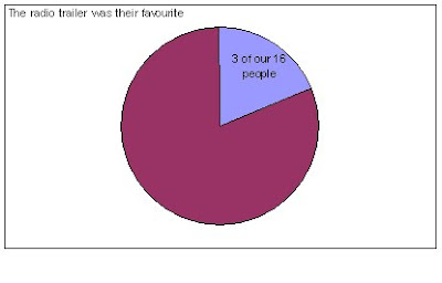
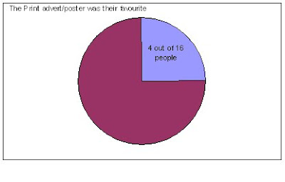
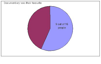
From these results I have learnt that our documentary was the favourite out of the three, and that the radio trailer was the least, i think our documentary and poster are also the strongest two as I believe they are the two most important elements because people will see the poster wherever they are weather its driving past or in a magazine. These were the reasons that people wrote down why they chose what they did;
Radio Trailer:
1) I like the radio trailer best because, I think it includes items from your documentary, and the girl used to speak sounds very good.
2) I really like the radio trailer as if I heard it when listening to galaxy etc I would most probably be likely to watch your documentary, also a lot of people listen to the radio so it would be advertised well, so a lot of people would no about it.
3) I like the music used at the beginning and the fact that you have used the same piece in your documentary, ties it all together.
Print Advert
1) The print advert is my favourite because the picture is so professional and a gorgeous photo, it would really make me want to watch your documentary, as it looks fun but interesting.
2) I really like the print advert because I think it looks like a channel 4 adverts, and channel 4 is my favourite channel so I would be most likely to watch it, as it looks different and fresh.
3) I love the picture, it looks really good and clear-the font is limited but the line ‘do you fancy it?’ makes it seem cheeky and quirky, making you wonder what it’s going to be about.
4) The main picture really catches my full attention, it makes a statement and I like the fact that its really close up and zoomed into them with no distractions, it also clearly states all the necessary information that you would need.
Documentary
1) The documentary is really good; the choice of interviews throughout is varied and kept me entertained, I would love to watch more.
2) I like the animations used, like the kiss at the beginning is cute and fun and the way the font zooms in when it’s on screen is like a real documentary.
3) I like the fact you used a lesbian couple, showing that it’s more varied and isn’t just typical man/women, boy/girl.
4) Its my favourite because I think it shows a lot of hard work and looks professional all the camera angles you have used are clean cut.
5) I like it best because I think it is really interesting and informative but is also entertaining, and doesn’t drag on, like I like the fact that you have used photo’s to go over the interviews so it makes it more interesting.
6) The music at the beginning is really fun and different.
7) I like the introduction where the heart float across screen and the clips of recognisable programmes like skins, as I love skins.
8) I like the interview with the expert lady at the end, gives you useful and interesting information.
9) It is all in a simple order, and easy to understand.
To get our audience feedback I did a variety of things. Firstly I put our Documentary on youtube, and got as many people to watch it and give us feedback, I also showed many people our poster and asked them to listen to the radio advert, so to get conclusions about this, I gave out 16 questionnaires asking what they thought of our documentary, and asked them to give me honest opinions.
The feedback that we received from these results has been written down and I have done a conclusion on Microsoft Excel from the questionnaires and I have also filmed some answers, to what they thought of the documentary when it was on youtube.
Questionnaire and results that I gave out to a number of people:
1) Did you like our documentary?

From this result i learnt that all the of the 16 people that filled out our questionaaire did like our beginning opening to documentary, which was very pleasing and a good result. We learnt that all our hard work has paid off and people said they enjoyed it, everyone that we asked enjoyed it which is a very postive conclusion.
2) Explain your resons (Why yes? Why no?)
This answer gives us the conclusion that many things are liked about our documentary, particulaly our choice of interviews, which i also think are our strongest element. Our animations are also popular, so we learnt that its better to have cheeky, fun animations to relate to attraction and love.
3) What could we improve on?
This gives us the conclusion that the sound is our weakest element, as it sounds uneven on youtube at the very beginning because of the music and voiceover, however after playing around with the volume levels are sound is now fixed and correct on adobe premire.
4) Does the theme interest you?

Most people said that the theme interested them because of the fact that their has never really been any documentarys about that explain about attraction, so would be interesting to find out more. I learnt that the 3 people that said no were not interested because they weren't really bothered about finding out attraction and it's just something that happens and they believe its a natural feeling.
5) After watching the introduction, would you want to watch the full half n hour?
 This outcome was very positive, as everyone we asked wanted to watch the full thing after seeing the first 5 minuites, from this i learnt that the most important part of a documentary is the first few minuites because people instantley can dicide weather they want to continue to watch it or turn over!
6) Do you think our interviews worked well?
 All 16 people that filled in our questionaire said that they thought our interviews worked well, this was because of the choice of interviews we used and the fact that we varied the age, sex, and genders to make it different and many different answers. We also learnt that in our interviews they all gave different answers to the same/similar questions, making it more varied and showing peoples different oppinions.
7) What did you think of the choice of music and voice over?
We learnt one again that our music at the beginning sounded a bit uneven and the music and voiceover in the first 5 seconds sounds a bit unlevel, however this concluded that the rest of the levels of sound is perfectly fine and the voice over is easy understood and clear to hear by our audience.
8) Do you think our film poster relates to our documentary? Why?
I asked many people this question and got all positive answers and will note down some of their answers:
1) I really liked your film poster, i think the picture is very strong and clear, it looks proffesional and i could see it up on a bill board somewhere passing by, and would no straight away that it was a channel 4 poster. Your main image is the strongest thing and is very well took and looks like a couple heavily in love.
2) The film poster is my favorite thing, i really like it, i think it's because it looks proffesional and is very eye-catching, as soon as i saw it i knew it had something to do with love or attraction, i like the fact that their is not to much overpowering font, but just important information and a cheeky 'do you fancy it?' line!
From this answer and others similar we learnt that our film poster worked really well and that people really did like it, i think the strongest point of the poster is the main central image because it is so powerful and meaningful and represents alot of things such as; love, happyness, lust and attraction which all heavily relate to our docmentary.
9) Did you like our film poster? And why?
 The majority of people said they liked our film poster for many reasons; People said they really liked the picture and thought it looked very professional, they also thought it resembled the channel 4 posters well as it looked very similar to them, they liked the fact that the picture was very eye-catching and that the boy and girl on it looked in love and happy relating to attraction/love. However one person said they didn't, we asked them their reasons and we learnt that they didn't like the style of font that we used and thought it should be bigger, they also thought that we should of made the photo black and white to make it more romantic. This gave us some good feedback which we can take on board for future.
10) What are your opinions of our radio trailer?
 "I thought your radio trailer was good, however i didn't really like the girls voice who spoke throughout, i thought her voice was very bland and boring, and didn't really interest me that much, i liked the fact that you added small clip bits from your documentary into your radio, i thought that was very clever and good."
"the radio trailer was the weekest for me, purley for the fact of the girls voice, she seemed abit dull and not fun and fresh, i also think to make it better you should have played music the hole way through to make it more exciting and fun and would of been a good song to play."
"The radio trailer was OK, i liked the things the girl was saying and it probably would of checked out your documentary, however i think you should of used the girl from your documentary on your voice over."

"I liked the fact that you used the same peice of music in the radio trailer and in the documentary, it tied it all together and made that song relevant to your piece."
"I really enjoyed your radio trailer, i thought it all flowed well and was like a proffesional one that you would hear on the radio, the only problem would be that the girls voice could of done with being a bit louder and abit more enthusiastic."
11) Would you be willing to watch our documentary after listening to the radio advert?

3/4 of the people said they really liked our radio trailer and thought it sounded good however a quarter of the people said they would not be willing to watch the documentary after listening to the trailer, there were many reasons for this such as:
1) The girls’ voice that we used to voice over, was a bit dull, and not very exciting making them not want to watch it as she had a boring voice.
2) The sound wasn't at a steady pace and seemed a bit up and down and dodgy-making it seems unprofessional.
3) The music needed to be on a little bit longer, as the music was fun, exciting and upbeat and it wasn't played for long enough.
4) Voice-over didn't seem very enthusiastic-sounded bored and sad.
12) What is your favourite item out of the radio trailer, documentary and poster? And why?


From these results I have learnt that our documentary was the favourite out of the three, and that the radio trailer was the least, i think our documentary and poster are also the strongest two as I believe they are the two most important elements because people will see the poster wherever they are weather its driving past or in a magazine. These were the reasons that people wrote down why they chose what they did;
Radio Trailer:
1) I like the radio trailer best because, I think it includes items from your documentary, and the girl used to speak sounds very good.
2) I really like the radio trailer as if I heard it when listening to galaxy etc I would most probably be likely to watch your documentary, also a lot of people listen to the radio so it would be advertised well, so a lot of people would no about it.
3) I like the music used at the beginning and the fact that you have used the same piece in your documentary, ties it all together.
Print Advert
1) The print advert is my favourite because the picture is so professional and a gorgeous photo, it would really make me want to watch your documentary, as it looks fun but interesting.
2) I really like the print advert because I think it looks like a channel 4 adverts, and channel 4 is my favourite channel so I would be most likely to watch it, as it looks different and fresh.
3) I love the picture, it looks really good and clear-the font is limited but the line ‘do you fancy it?’ makes it seem cheeky and quirky, making you wonder what it’s going to be about.
4) The main picture really catches my full attention, it makes a statement and I like the fact that its really close up and zoomed into them with no distractions, it also clearly states all the necessary information that you would need.
Documentary
1) The documentary is really good; the choice of interviews throughout is varied and kept me entertained, I would love to watch more.
2) I like the animations used, like the kiss at the beginning is cute and fun and the way the font zooms in when it’s on screen is like a real documentary.
3) I like the fact you used a lesbian couple, showing that it’s more varied and isn’t just typical man/women, boy/girl.
4) Its my favourite because I think it shows a lot of hard work and looks professional all the camera angles you have used are clean cut.
5) I like it best because I think it is really interesting and informative but is also entertaining, and doesn’t drag on, like I like the fact that you have used photo’s to go over the interviews so it makes it more interesting.
6) The music at the beginning is really fun and different.
7) I like the introduction where the heart float across screen and the clips of recognisable programmes like skins, as I love skins.
8) I like the interview with the expert lady at the end, gives you useful and interesting information.
9) It is all in a simple order, and easy to understand.
Evaluation 2
Evaluation 1
1) In what ways does your media product use, develop or challenge forms and conventions of real media products?
Our documentary, which is in the theme of ‘Attraction’, is similar and uses conventions of real documentaries in many ways.
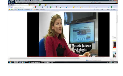
Firstly through the variety of our Interviews. We used an Expert (physiologist) who answered questions that many people would like to no the answers of and are very interesting points, she comes across very professional with lots of detailed and descriptive answers. She is wearing a red dress and blazer- emphasising her profession and she looks intelligent, the red she is wearing also represents love which is what she is discussing in the interview, The shot we have framed her in, is simple with a computer behind her, making it look as if she is studying now and in her profession.
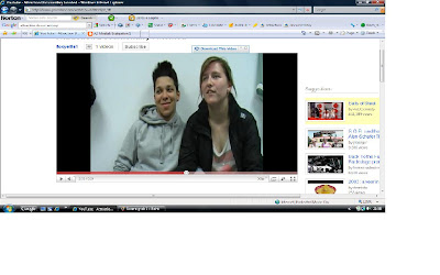
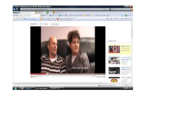
We also interviewed a variety of couples of all ages and relationship status, showing a variety of people that the audience can relate too. All of our interview shots are of the head and shoulders, there are no distracting backgrounds, and we used simple settings showing a good mise en scene. Nobody was looking at the camera, so when sat on the left hand side of the camera couples were looking to the right, which looks professional and uses the conventions of real media documentaries.
Compared to a real media interview.....
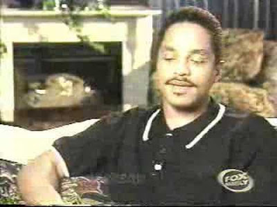
When being interviewed no questions where heard, so all answers in interviews where answered at the start of the question for example ‘I do no believe in love at first site because…’ it all makes sense and is easy understood.
The voiceover we used has conventions of media products because she sounds clear, and is easy to understand, she is well spoken and speaks loudly and in a pace that the audience can hear and think about what she’s saying, the audience feel that she has knowledge about what’s she’s talking about and can relate to her, and her opinions and knowledge are not biased and people can engage with her. Her voice goes up and down in pitch making her more enjoyable and interesting to listen too.
The Lightening we used is all natural light, so gives the audience a sense of realism, no unclear shots, very visible and bold, which makes our documentary seem professional.
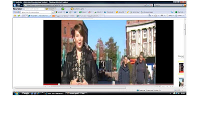
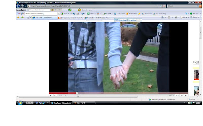
Compared to real media vox pops and lighting.....
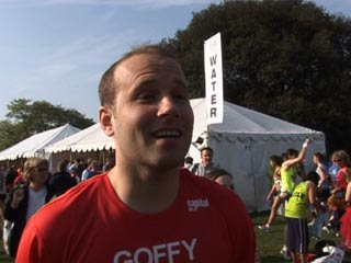
The use of archive footage that we have put in our documentary was a limit of 30 seconds, we used shots of programmes that our well known e.g. eastenders and skins, which adds further information about our documentary, and is more informative/interesting and entertaining.
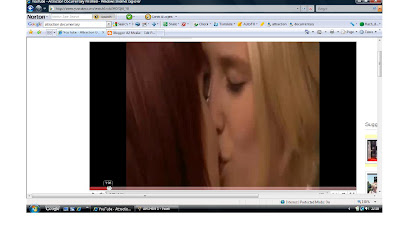
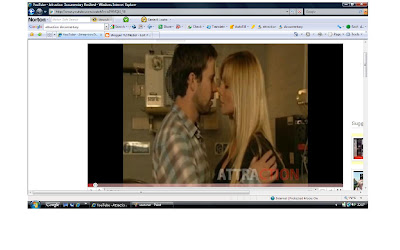
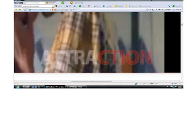
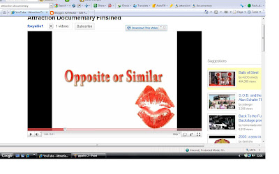
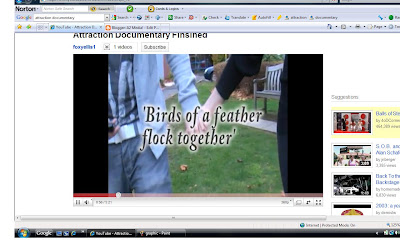
We used small amounts of graphics- Text/Font, we chose to have fun, flirty text as it represents our documentary as exciting and fresh, we made our colours red and white to symbol two things, Firstly red symbols love and lust which relates to the theme of our documentary Attraction so everything ties together, and secondly is represents the colours of a magnet suggesting that people fall in love and are attracted to each other like a magnet, which covey’s our message across.
The music- placed at the beginning of our documentary is non diagetic sounds we chose a loud, upbeat song which makes our documentary more fun and exciting but gives information across but in an entertaining way. The lyrics to the song ‘might like you better baby’ are fun and cheeky and work well with our film perfectly.
The rest of the documentary is mainly diagetic sounds of voiceovers, interviewees and vox pops.
In our Print Advert their are also many ways in which our product uses conventions of real media products.
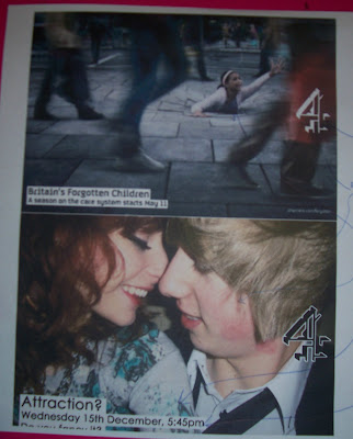
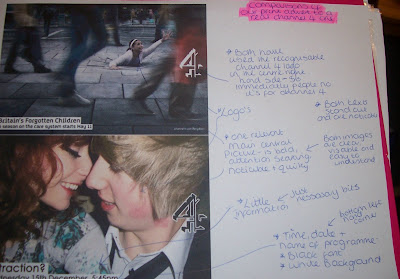
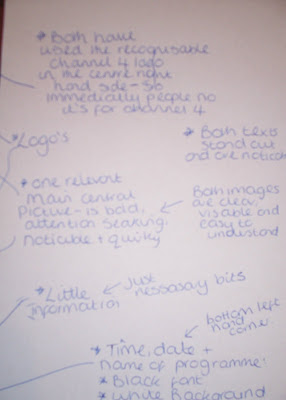
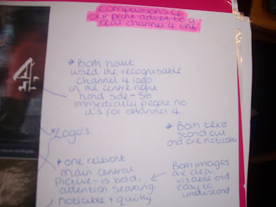
I annotated our Print advert in comparason to a very similar one from channel 4's 'Britians Forgotten children'. We have used many similar codes and conventions of real print adverts, and compared them together. Our print advert represents channel 4 print adverts very well as it looks like it would be seen on a bill board or in a magazine.
For our radio trailer we have also used codes and conventions of real media products today. Fom researching and listening to many radio trailers, i made notes of the conventions of radio trailers this has helped me alot in creating our own, as i knew exacty what to involve on it. Firstly we clearly stated the time, channel and programme name so that as soon as listeing to the trailer the audience know's what it is about and when it's on so they don't miss it. We have also used sound bites taken from our documentary this gives people a brief insight into what our documentary will be about and gives you a taster of it. The voice over that we used was very well spoken and easy understood, she sounds fun, fresh and interesting making people want to watch our documentary as it seems interesting and entertaining. The background music that we used was taken from our documentary, it is a song that has not been in the charts so is quirky and represent our programme-so that when people hear it, they no immediatly what it's from, which engages with the listener.
Our documentary, which is in the theme of ‘Attraction’, is similar and uses conventions of real documentaries in many ways.
Firstly through the variety of our Interviews. We used an Expert (physiologist) who answered questions that many people would like to no the answers of and are very interesting points, she comes across very professional with lots of detailed and descriptive answers. She is wearing a red dress and blazer- emphasising her profession and she looks intelligent, the red she is wearing also represents love which is what she is discussing in the interview, The shot we have framed her in, is simple with a computer behind her, making it look as if she is studying now and in her profession.

We also interviewed a variety of couples of all ages and relationship status, showing a variety of people that the audience can relate too. All of our interview shots are of the head and shoulders, there are no distracting backgrounds, and we used simple settings showing a good mise en scene. Nobody was looking at the camera, so when sat on the left hand side of the camera couples were looking to the right, which looks professional and uses the conventions of real media documentaries.


Compared to a real media interview.....

When being interviewed no questions where heard, so all answers in interviews where answered at the start of the question for example ‘I do no believe in love at first site because…’ it all makes sense and is easy understood.
The voiceover we used has conventions of media products because she sounds clear, and is easy to understand, she is well spoken and speaks loudly and in a pace that the audience can hear and think about what she’s saying, the audience feel that she has knowledge about what’s she’s talking about and can relate to her, and her opinions and knowledge are not biased and people can engage with her. Her voice goes up and down in pitch making her more enjoyable and interesting to listen too.
The Lightening we used is all natural light, so gives the audience a sense of realism, no unclear shots, very visible and bold, which makes our documentary seem professional.


Compared to real media vox pops and lighting.....

The use of archive footage that we have put in our documentary was a limit of 30 seconds, we used shots of programmes that our well known e.g. eastenders and skins, which adds further information about our documentary, and is more informative/interesting and entertaining.


We used small amounts of graphics- Text/Font, we chose to have fun, flirty text as it represents our documentary as exciting and fresh, we made our colours red and white to symbol two things, Firstly red symbols love and lust which relates to the theme of our documentary Attraction so everything ties together, and secondly is represents the colours of a magnet suggesting that people fall in love and are attracted to each other like a magnet, which covey’s our message across.


The music- placed at the beginning of our documentary is non diagetic sounds we chose a loud, upbeat song which makes our documentary more fun and exciting but gives information across but in an entertaining way. The lyrics to the song ‘might like you better baby’ are fun and cheeky and work well with our film perfectly.
The rest of the documentary is mainly diagetic sounds of voiceovers, interviewees and vox pops.
In our Print Advert their are also many ways in which our product uses conventions of real media products.
I annotated our Print advert in comparason to a very similar one from channel 4's 'Britians Forgotten children'. We have used many similar codes and conventions of real print adverts, and compared them together. Our print advert represents channel 4 print adverts very well as it looks like it would be seen on a bill board or in a magazine.


For our radio trailer we have also used codes and conventions of real media products today. Fom researching and listening to many radio trailers, i made notes of the conventions of radio trailers this has helped me alot in creating our own, as i knew exacty what to involve on it. Firstly we clearly stated the time, channel and programme name so that as soon as listeing to the trailer the audience know's what it is about and when it's on so they don't miss it. We have also used sound bites taken from our documentary this gives people a brief insight into what our documentary will be about and gives you a taster of it. The voice over that we used was very well spoken and easy understood, she sounds fun, fresh and interesting making people want to watch our documentary as it seems interesting and entertaining. The background music that we used was taken from our documentary, it is a song that has not been in the charts so is quirky and represent our programme-so that when people hear it, they no immediatly what it's from, which engages with the listener.
Subscribe to:
Comments (Atom)


